This project is about capturing mood through editing. Different textures and tones create depth and feeling in the grids. Viewers can experience different things and feel different emotions depending on what they see in each grid. Throughout this project we learned how to make grids that are not only a normal square pattern but also have an unique touch.
Warm Color Grid
For this grid I did a simple box pattern and alternated the pictures. I tried to make the reds pop as much as I could by upping the red and bringing down the colors in the background. Every other row I have two of the pictures flipped upside down. The best photo that shows it is upside down is the one with the leafs and the green background.
Cold Color Grid
This grid is made up of different pictures of water. I made the blue and greens in the water brighter than they were originally so they would standout more. I brought the light down in the background and mad the shadows darker.
Monochrome Grid
Monochrome is most often in black and white but it can also be in color as long as it is the some color in different shades. For my grid I took a four different pictures of green plants that were in various shades. I took the shadows from as dark as I could get them while still being able to tell what the photo is to almost as bright as I could get them. I think changing the shadows really makes the point that they are supposed to be distinctive shades.
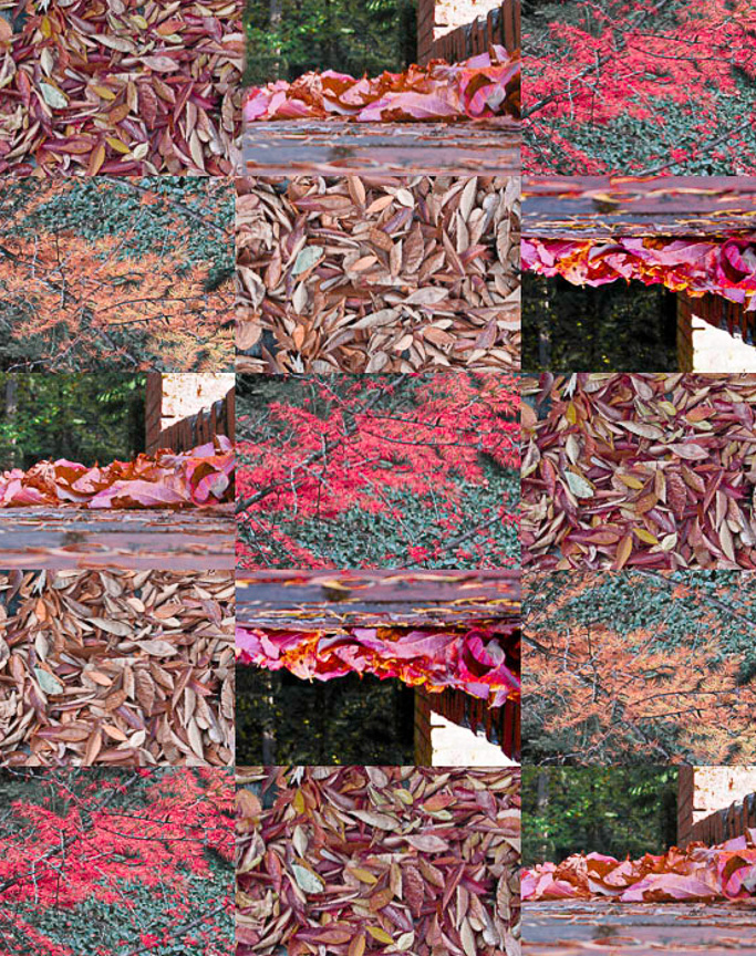
Color Complementary Grid
The complementary colors in this grid are red and green. I picked these colors because I think they are a classic color combination as they are one of the easiest color complementary combination to find in nature. For the grid I picked pictures of leafs and sticks that were green and red. I didn't edit the colors very much because they were already pretty prominent and showed the differences in the colors.
Grid
This grid isn't supposed to be a certain type of grid. I really like how the moss looked on the pipe and how the moss had so many different details in it. The only editing I did was brighten the green a little so it would standout.
Grid
This grid is a combination of three different pictures. For this grid I didn't do any editing with the lighting or colors the only thing I did was crop different parts of the pictures. I really like how they all fit together and how the lack of brightness shows the weather was cloudy. The reason I think it shows that tone is because they are all cohesive shades.
Mood Photo
This photo is a single leaf surrounded by pine needles. To me this is showing the mood of loneliness because the leaf is all alone and different. The light brings our eye to the leaf which makes it the center of attention while the pine needles slowly fade into the dark because they are all the same.