
ELLE POLAND
I like how they made her features very soft and how you instantly look at her face even though she has a very pronounced crown. Putting the Black and White gives the photo a calm but stern feeling.

I like this photo because it has a similar feel as the top photo. The two photos have many different qualities to them; they do have some things in common they both have the model wearing something on their heads, they have a soft look to them and even though the top picture doesn't have any color the bottom ones colors aren't very prominent so they both have a dull look to them but that also makes them standout.

Photographer: Matt Jones
I like this magazine cover because it is very happy and bright. They tie the dice and the shirt together with the red color but they are a darker red so they make you notice them because the rest of the photo is very bright.
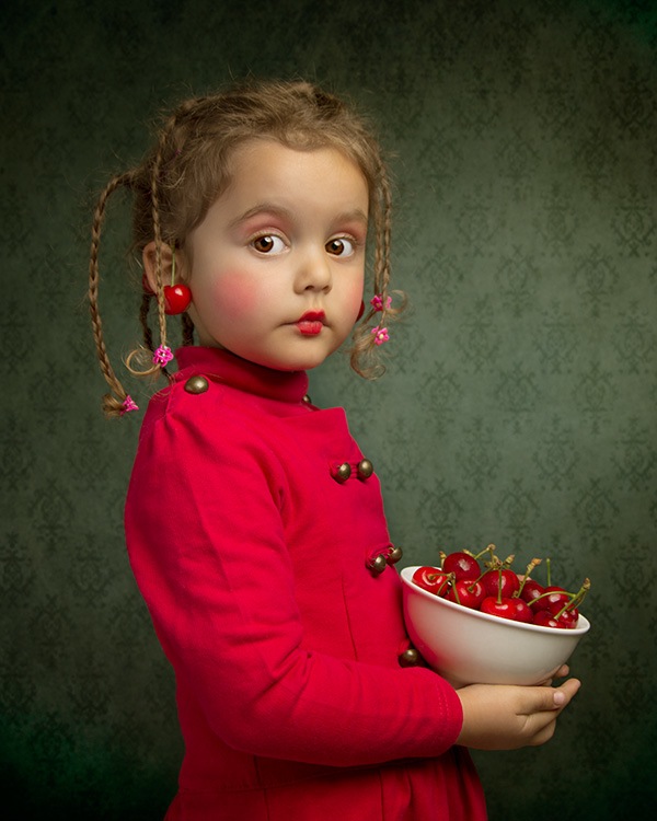
Photographer: Bill Gekas
This picture seems very innocent to me because it is a little girl with a look on her face like she's about to do something she shouldn't. Both the photos have red in them, they also have a light hearted feeling to them. The top picture has a light colored background and her clothes are dark but in the bottom photo the background is dark and the clothes are light.
No comments:
Post a Comment